VCA
VCA
VCA
Responsive redesign of the non-profit Vegetarian Consumers Association landing page, including updated strategy, content design, and style guide.
Responsive redesign of the non-profit Vegetarian Consumers Association landing page, including updated strategy, content design, and style guide.
Type
Conceptual
Timeline
1 Week
Team
Solo
Tools
Figma, Figjam, Notion, Raycast AI
Type
Conceptual
Timeline
1 Week
Team
Solo
Tools
Figma, Figjam, Notion, Raycast AI
Overview
The goal is to enhance the user interface so the organisation can boost donations and visibility. Additionally, I explored possibilities to upgrade the business strategy.
The current landing page is lacking a clear call-to-action, content and information about the association and their mission or how they can help businesses improve their menus or services.
Final Design
Final Design

Case Study
Case Study
Case Study
You can view the extended version of the case study on Notion.
You can view the extended version of the case study on Notion.
You can view the extended version of the case study on Notion.
Problem
The current landing page is lacking a clear call-to-action, content and information about the association and their mission or how they can help businesses improve their menus or services.
Problem
The current landing page is lacking a clear call-to-action, content and information about the association and their mission or how they can help businesses improve their menus or services.
Goal
Enhance the user interface so the organisation can boost donations and visibility. Additionally, I want to explore possibilities to upgrade the business strategy and, as a result, the content.
Goal
Enhance the user interface so the organisation can boost donations and visibility. Additionally, I want to explore possibilities to upgrade the business strategy and, as a result, the content.
Project
The Vegetarian Consumers Association, a non-profit organisation that connects restaurants with vegetarian and vegan consumers and offers them free expert advice. I chose this organisation because I have been a vegetarian/vegan for a long time, and it presented the most significant design challenge among the four options we were presented.
Before
Landing Page
Before
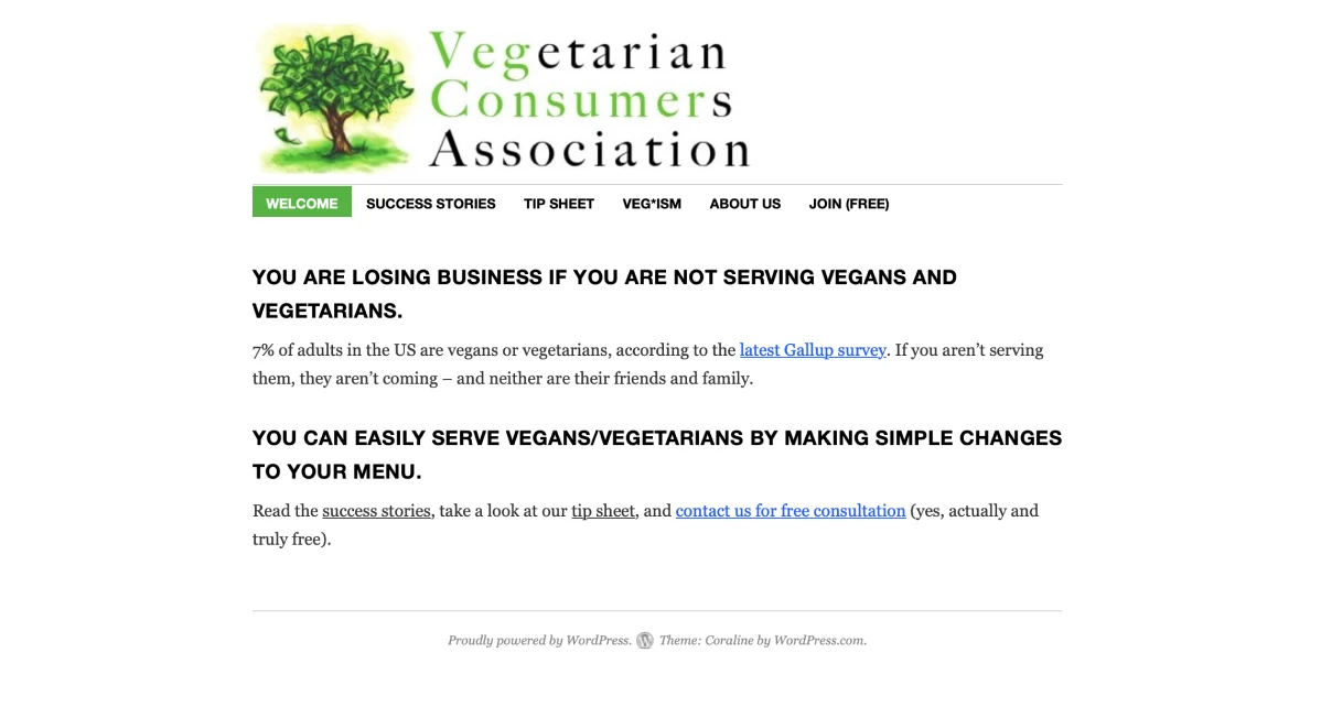
The original design is shown above. As you can see, there isn't much content available on the landing page, leading me to question the potential for improving the business model and strategy. This is where market research came in handy.
Project
The original design is shown above. As you can see, there isn't much content available on the landing page, leading me to question the potential for improving the business model and strategy. This is where market research came in handy.
Research
Competetive & Comparative Research
I looked at two different vegetarian & vegan associations or organisations to learn more about their business strategies, target audiences, and visual language. This enabled me to identify opportunities to stand out from the competition. Vegetarian/vegan organisations often use earthy, "eco" colours, such as green, in their designs to promote healthy eating and environmental awareness. However, this style of UI can look a bit dated. I saw an opportunity to stand out.
Research
I looked at two different vegetarian & vegan associations or organisations to learn more about their business strategies, target audiences, and visual language. This enabled me to identify opportunities to stand out from the competition. Vegetarian/vegan organisations often use earthy, "eco" colours, such as green, in their designs to promote healthy eating and environmental awareness. However, this style of UI can look a bit dated. I saw an opportunity to stand out.

Most organisations prioritise consumers as their primary audience. This led me to B Lab, a company that strives for environmental and social progress. Their focus is on businesses, and their aesthetic is modern and clean, making them seem professional and credible. They have a clear call-to-action, good storytelling, statistics, and the latest news on their subject.
Most organisations prioritise consumers as their primary audience. This led me to B Lab, a company that strives for environmental and social progress. Their focus is on businesses, and their aesthetic is modern and clean, making them seem professional and credible. They have a clear call-to-action, good storytelling, statistics, and the latest news on their subject.
Business Strategy
As a vegan, I understand the challenges consumers face and believe it would be beneficial to expand the business to non-food sectors, such as travel, hospitality, education, business, wellness, and health. Companies like Dove and Garnier are now providing vegan and cruelty-free products, and sites like Happy Cow and Veggie Hotels prove that there is an increasing demand for these services.
Moodboards
Look & Feel
Moodboards
Look & Feel
Professional, modern, informative, motivational & inspirational
Professional, modern, informative, motivational & inspirational

You can see a very clean visual language with a lot of negative space, which helps the content stand out, modern sans-serif fonts, and an earthy yet modern, vibrant colour scheme.
You can see a very clean visual language with a lot of negative space, which helps the content stand out, modern sans-serif fonts, and an earthy yet modern, vibrant colour scheme.
Initial Style Guide
I selected "Inter" as my typeface because it had the modern, clean look I envisioned in my moodboard. The colour palette I drew from the reference image, plus a few neutrals, provide depth in the design. I included the pre-selected images and sourced relevant brand logos for the context.
Ideation
Content
Before I began designing, I had to create content for my strategy. I set an initial structure, then used Raycast AI to help me write the content. I didn't have time to verify the results, but it should be enough for an UI focused project.
Ideation
Content
Before I began designing, I had to create content for my strategy. I set an initial structure, then used Raycast AI to help me write the content. I didn't have time to verify the results, but it should be enough for an UI focused project.
Low-Fi Wireframes
I moved on to wireframing, taking a mobile-first approach for the low-fi version. It was the first time I worked in that order and it was a challenge to adapt to the desktop version. This encouraged me to experiment with the layout, such as removing the card elements for the testimonial section.

Logo
The original design didn't have a logo I could use; they had a money tree illustration, which wasn't suitable for a non-profit organisation. It lacked the professional look and brand recognition value. To address this, I created a moodboard with some clean logo examples and shortened the name to VCA, as it was easier to say and better suited the modern approach.
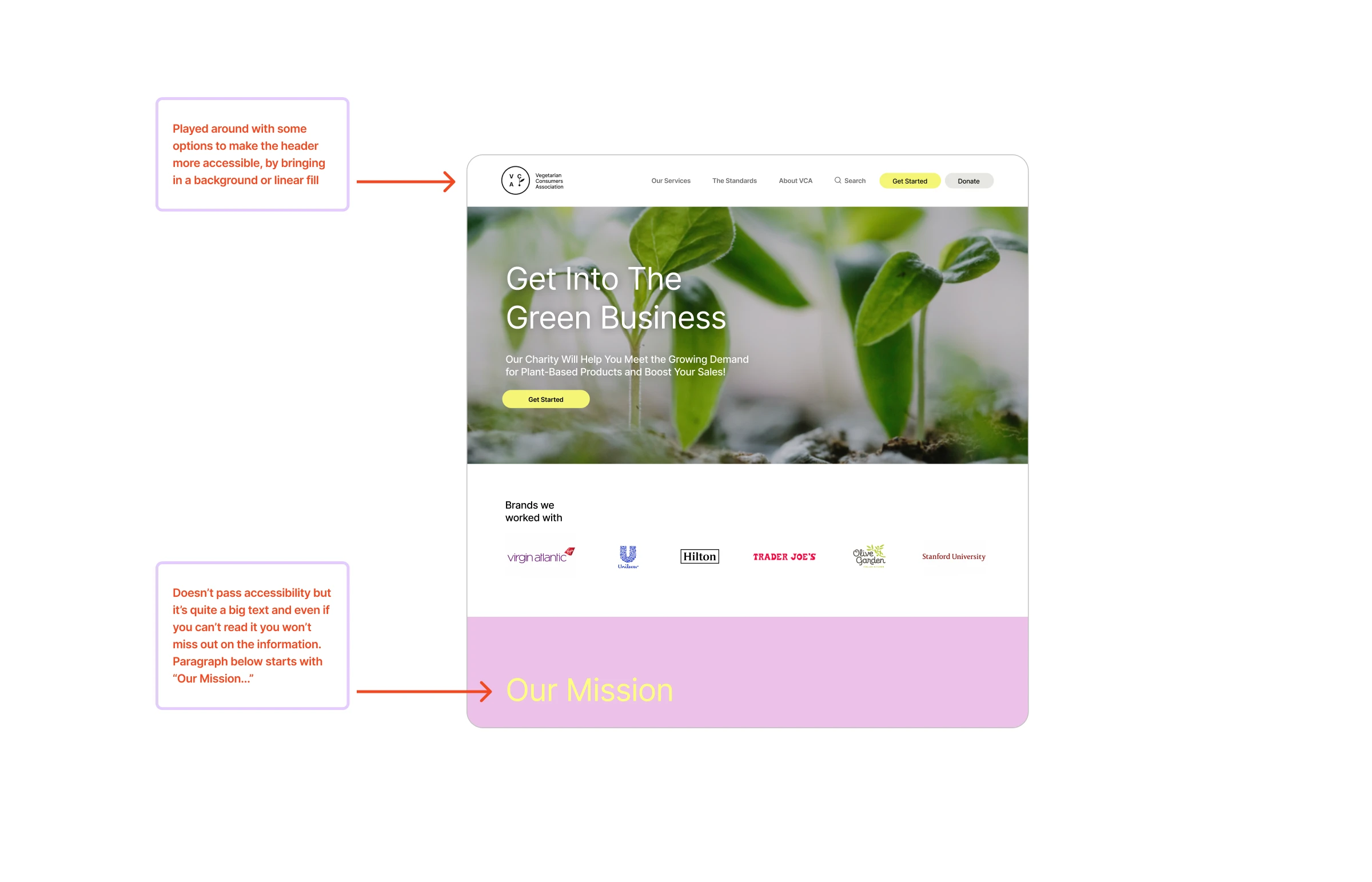
I quickly reevaluated the cards for the "services" section. It didn't seem important enough, so I tried larger cards and experimented with colours as a solid background. The colour made the website look too playful and gave it a brand marketing vibe. After exploring, I realised I didn't want to use all the colours. Some of them were too heavy and not as modern and fresh. I was looking for an effective way to emphasise essential statistics that would convince businesses to collaborate with the charity. A circle made perfect sense, as it harmonised with the rounded buttons, logo, and cards. It creates a spotlight effect. Also, the yellow highlights are a recurrent design element throughout the design.
Design Critique
During our first design critique, we discussed the accessibility of the navigation header and the yellow text on the pink background. I made a few changes to the header, but kept the yellow text. I argued that the paragraph contains all the necessary information, even if the yellow text is not visible. I saw it more as a visual element at this stage.
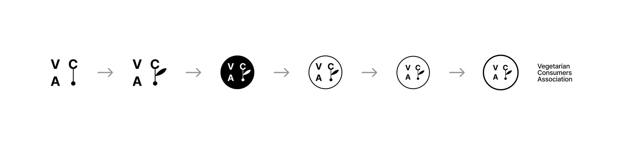
Progress of the design can be seen from left to right. I began with the letters and a connector, adding a nice detail as the organisation is connecting businesses with consumers. The leaf took it to the next level, providing a nice touch.
Mobile
Afterwards, I began designing my mobile wireframes. I didn’t run into many issues as I had already set out all the sections. I needed to adjust the image crop to the new ratio and make the cards suitable for the small viewport. For the mobile navigation, I initially used a hamburger menu, but it looked too similar to the logo, so I changed it to "Menu".
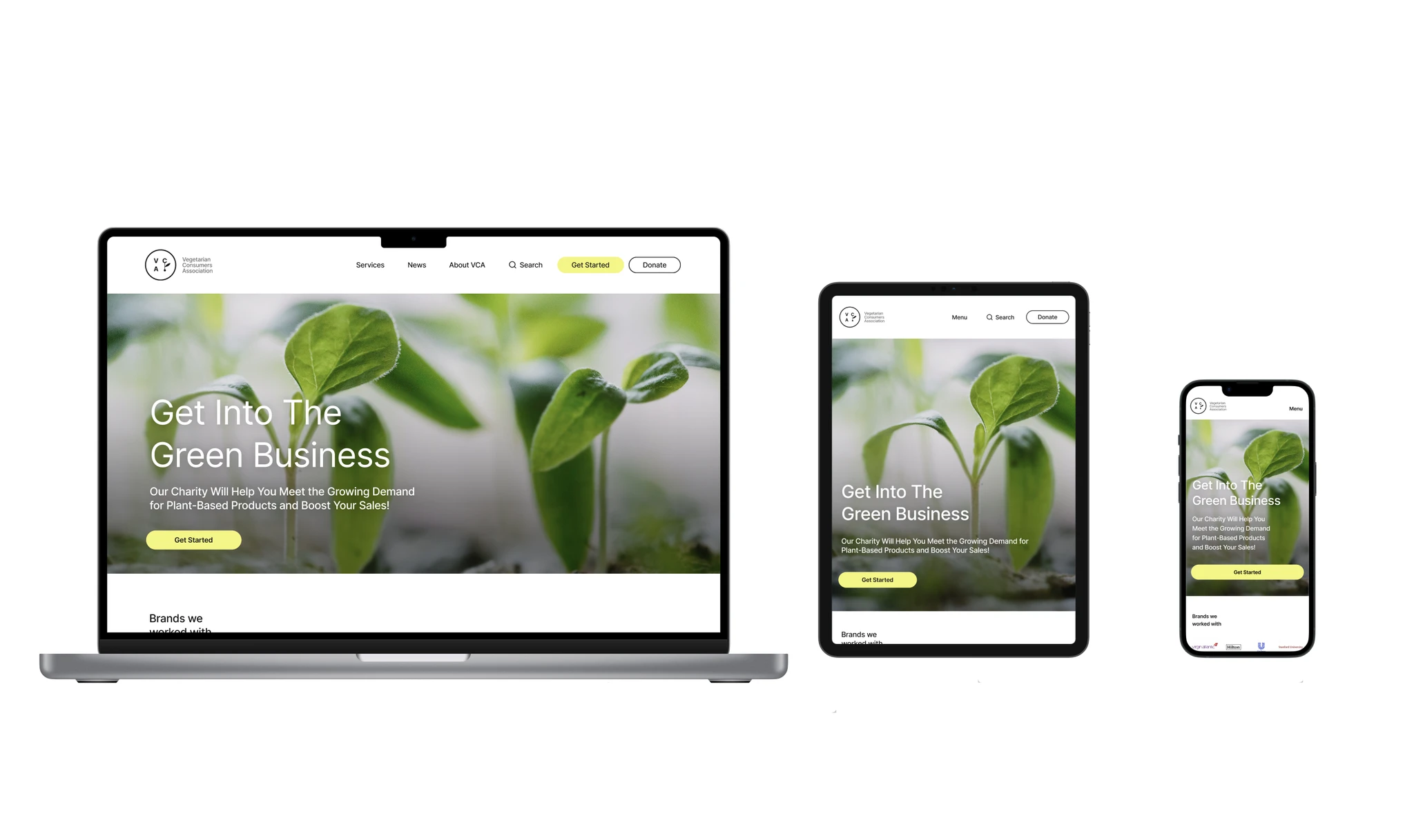
High-Fidelity Wireframes
I was confident enough to move forward with a more high-fidelity version of the design and implement my content and experimented with colours. I started with the desktop version, since I had the layout already set out and more room for visual exploration. Also, I assumed that the professional audience would mostly view the site from larger viewports. I included the pre-selected images and sourced relevant brand logos for the context.
Tablet
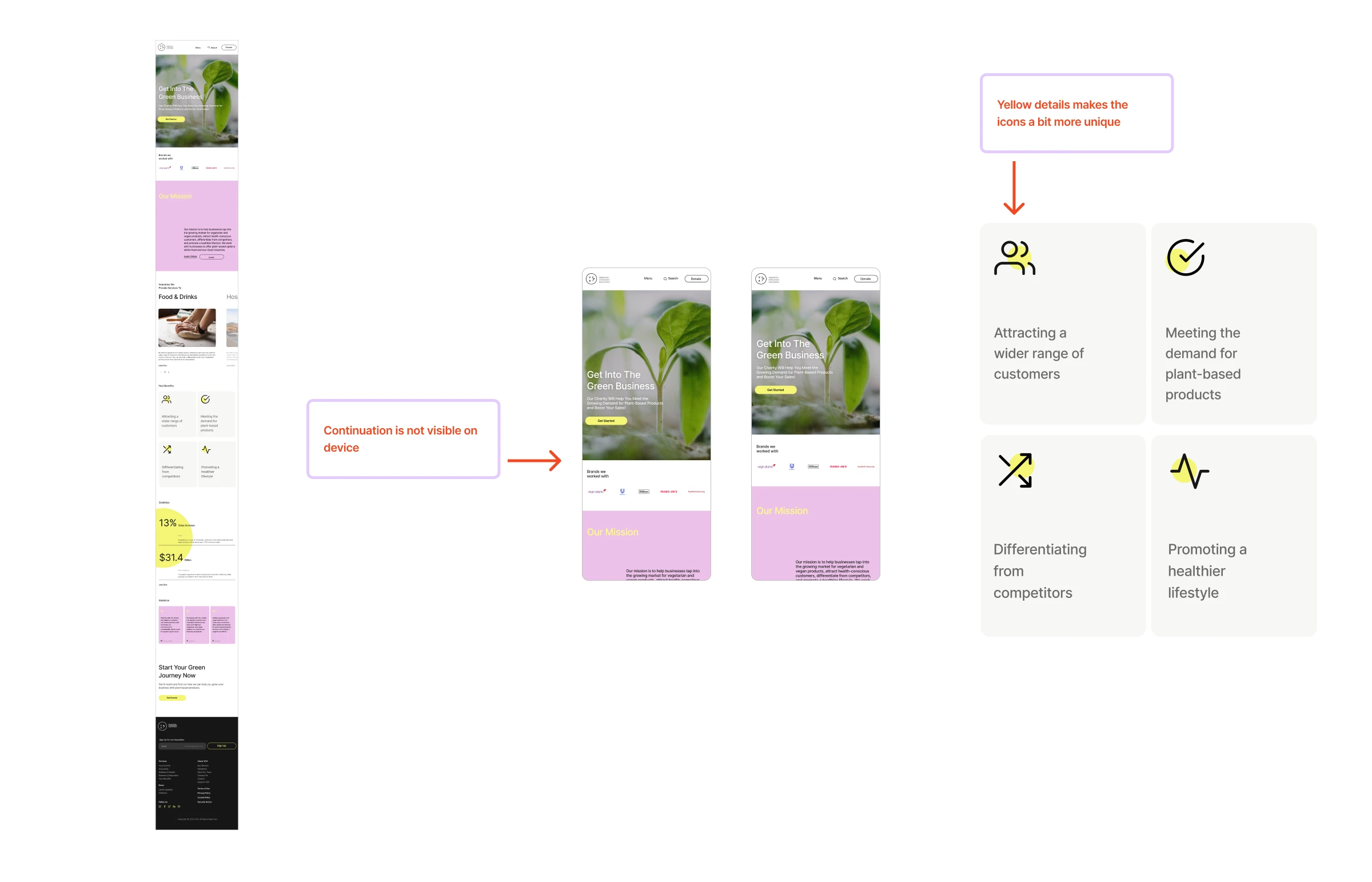
The tablet design was a straightforward combination of desktop and mobile elements. Throughout the development, I frequently tested the design on an actual device to ensure that sections remained short and teased continuation. I repurposed the yellow accent color to refresh and customize the original Feather icons for a more cohesive appearance with the rest of the website.

I quickly reevaluated the cards for the "services" section. It didn't seem important enough, so I tried larger cards and experimented with colours as a solid background. The colour made the website look too playful and gave it a brand marketing vibe. After exploring, I realised I didn't want to use all the colours. Some of them were too heavy and not as modern and fresh. I was looking for an effective way to emphasise essential statistics that would convince businesses to collaborate with the charity. A circle made perfect sense, as it harmonised with the rounded buttons, logo, and cards. It creates a spotlight effect. Also, the yellow highlights are a recurrent design element throughout the design.
Design Critique
During our first design critique, we discussed the accessibility of the navigation header and the yellow text on the pink background. I made a few changes to the header, but kept the yellow text. I argued that the paragraph contains all the necessary information, even if the yellow text is not visible. I saw it more as a visual element at this stage.
Mobile
Afterwards, I began designing my mobile wireframes. I didn’t run into many issues as I had already set out all the sections. I needed to adjust the image crop to the new ratio and make the cards suitable for the small viewport. For the mobile navigation, I initially used a hamburger menu, but it looked too similar to the logo, so I changed it to "Menu".
High-Fidelity Wireframes
I was confident enough to move forward with a more high-fidelity version of the design and implement my content and experimented with colours. I started with the desktop version, since I had the layout already set out and more room for visual exploration. Also, I assumed that the professional audience would mostly view the site from larger viewports. I included the pre-selected images and sourced relevant brand logos for the context.

Tablet
The tablet design was a straightforward combination of desktop and mobile elements. Throughout the development, I frequently tested the design on an actual device to ensure that sections remained short and teased continuation. I repurposed the yellow accent color to refresh and customize the original Feather icons for a more cohesive appearance with the rest of the website.
Progress of the design can be seen from left to right. I began with the letters and a connector, adding a nice detail as the organisation is connecting businesses with consumers. The leaf took it to the next level, providing a nice touch.
Deliver
Final Design
Following feedback on the prior version, I experimented with a linear grade to improve the readability of the white text on the image. Additionally, I adjusted the spacing between sections to make it uniform and set the body type for desktop and tablet to 20px instead of 16px. I discussed the yellow text on pink with a colleague and she made a great point that the header is part of the navigation. To improve scannability, I changed the header to “Almost Black”.

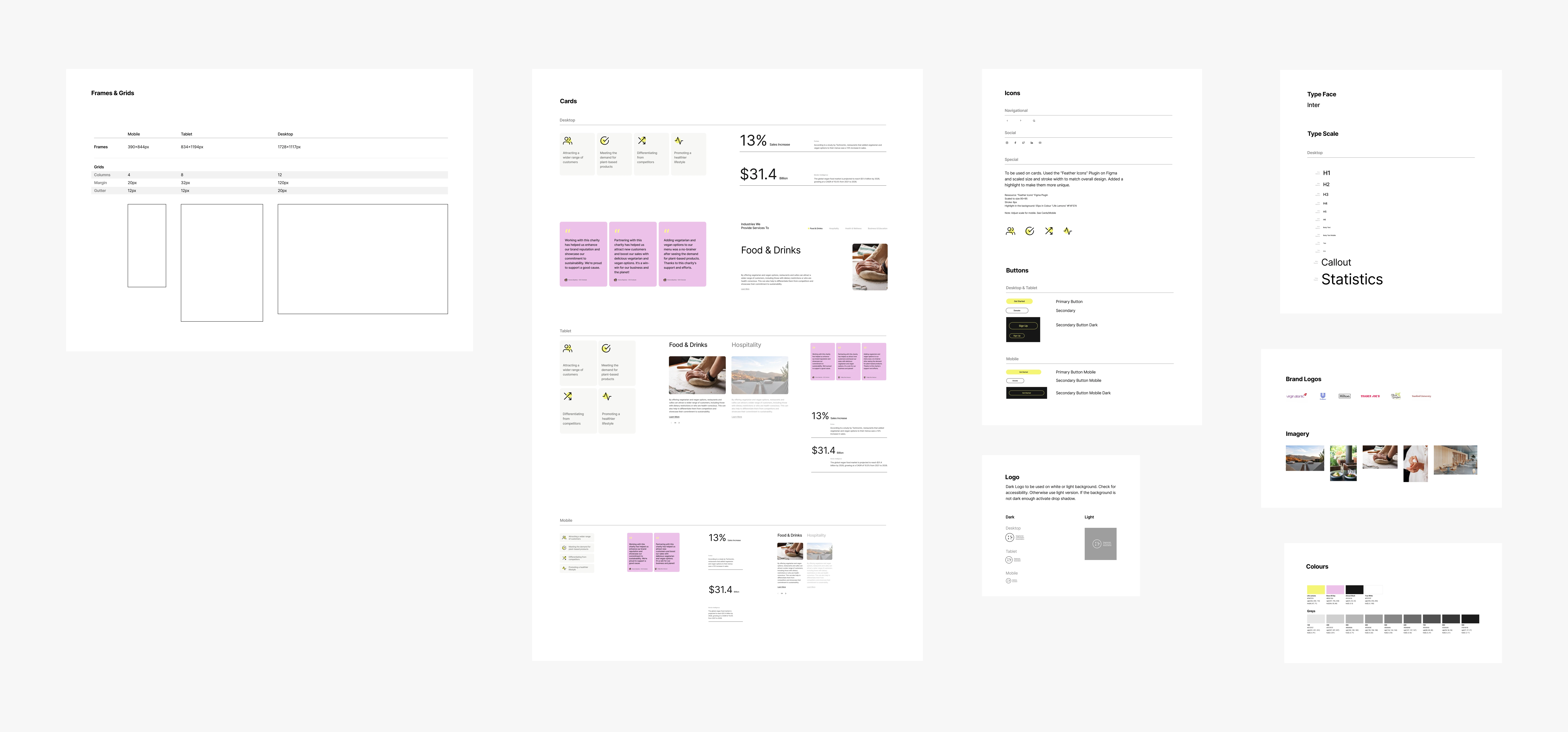
Updated Style Guide
Updated Style Guide
What's Next
1. Usability Testing 2. Turn elements into components once validated 3. Design Onboarding and Membership Portal It would be great If I had the chance to launch this design and see how it affects the organisation.
What's Next
This project has been a great challenge due to its ambiguous scope. I prioritized and focused on the most important features for the business. If I had the chance, I would conduct a survey and interviews to gain deeper insights into users' problems. Additionally, I would have liked to conduct user testing to see the feedback users would give after the redesign and its impact on the business.
Reflection
Designing for mobile-first was a challenge, as it was a new approach for me. Also, I was surprised at how difficult I found it to start designing without being able to do research properly due to time constraints. This shows me how important I find the UX process and how much I've grown in the last few months.
Reflection
This project has been a great challenge due to its ambiguous scope. I prioritized and focused on the most important features for the business. If I had the chance, I would conduct a survey and interviews to gain deeper insights into users' problems. Additionally, I would have liked to conduct user testing to see the feedback users would give after the redesign and its impact on the business.
You can view the extended version of the case study on Notion.
You can view the extended version of the case study on Notion.
© Kristina Loewen 2023